.svg)
.svg)
Are you a business owner, freelancer, or digital marketer seeking a user-friendly approach to designing and constructing websites without any coding expertise?
Alternatively, are you a beginner aspiring to grasp the art of web design within a visual realm?
If you fall into any of these categories, Webflow is the ideal solution for you.
Webflow stands as an inventive, visual web design tool that empowers both novices and professionals alike to design, develop, and launch responsive websites visually, all while generating clean, semantic code automatically.
With Webflow, you hold the reins of the design process, allowing you to make updates at your convenience, without the need for extensive coding proficiency.
Within this guide, we will delve into the array of features and advantages that Webflow offers, illustrating how it streamlines the process of crafting captivating websites with remarkable ease.
We will explore the various customizable templates, the merits of responsive design, and the seamless integration of Webflow with other marketing tools.
Additionally, we will furnish you with invaluable insights and best practices to ensure you harness the full potential of this versatile platform
Mobile-First Approach:
Embracing the mobile-first approach means designing your website primarily for mobile devices and then scaling up for larger screens. We'll discuss the benefits of this approach and demonstrate how to apply it in Webflow to ensure your site performs exceptionally on mobile devices.
A substantial portion of global internet traffic originates from mobile phones, surpassing any brand or operating system distinctions.
These devices have taken the lead in the market and continue to gain power, efficiently accommodating responsive web designs.
Opting to scroll through web pages on a mobile device, rather than navigating a laptop or desktop, has become the preferred choice.
In light of this, it's essential to prioritize designing your website for mobile users as a central part of your target audience.
This involves adopting a mobile-first approach and giving precedence to maximizing available space width, ensuring seamless navigation through breakpoints, and incorporating high-resolution images that maintain swift loading times.
Furthermore, the mobile iteration of your website need not be confined to a fixed width.
A mobile-friendly website can effectively employ adaptable CSS media queries, multiple templates, and frameworks that typically demand coding expertise. With Webflow, you can sidestep the complexities of mobile optimization as it handles the technical aspects on your behalf, sparing you the need to struggle with mobile enhancements."
Designing with Flexbox and Grid
Webflow's Flexbox and Grid systems offer powerful tools to create flexible and dynamic layouts. Learn how to leverage these features to design responsive structures that automatically adjust based on the screen size, making your content look equally impressive on every device.
Image and Media Optimisation
Large images can significantly impact page load times, affecting user experience. Discover techniques to optimize images and media without compromising quality, ensuring quick load times and smooth performance across devices.
Use services like https://compressjpeg.com to compress your images, also once your upload your png images make sure to turn them into Webp.
WebP is a modern image format that provides superior lossy compression for images on the web. Using WebP, webmasters and web developers can create smaller, richer images that make the web faster. WebP lossless images are 26% smaller in size compared to PNGs.
Interactions & Animations
To ensure that interactions and animations remain responsive in Webflow, follow these best practices:
- Use Relative Units: Utilize relative units like percentages (%), viewport height (vh), viewport width (vw), or ems for element sizes and positions. This allows elements to adapt to different screen sizes.
- Design for Different Breakpoints: Create separate layouts for various screen sizes using Webflow's breakpoints feature. Customize interactions and animations for each breakpoint to ensure they appear and function optimally.
- Flexbox and Grid: Utilize CSS Flexbox and Grid layouts to create dynamic and flexible designs that adapt well to different screen sizes.
- Test on Real Devices: Regularly test your interactions and animations on actual devices to ensure they function smoothly and look appealing on various screen sizes.
- Avoid Hard-Coded Values: Refrain from using fixed pixel values for element sizes and positions, as they can lead to non-responsive designs. Instead, rely on percentage-based or relative units.
- Relative Positioning: When animating elements, use relative positioning or transforms to maintain the element's position within the layout as it animates.
- Use VW/VH for Typography: To maintain readable text across devices, use viewport width (vw) and viewport height (vh) units for font sizes instead of fixed pixel values.
- Optimize Images: Ensure that images used in animations are appropriately sized and compressed to prevent slowing down the loading time.
- Preview on Different Devices: Use Webflow's Preview feature to test your interactions on various devices and breakpoints before publishing.
- Consider Performance: Be cautious with complex animations that might slow down the website's performance. Use interactions that enhance user experience without causing lag.
- Use Conditional Visibility: If animations involve hiding or showing elements, use Webflow's conditional visibility feature to adjust the visibility of elements based on breakpoints.
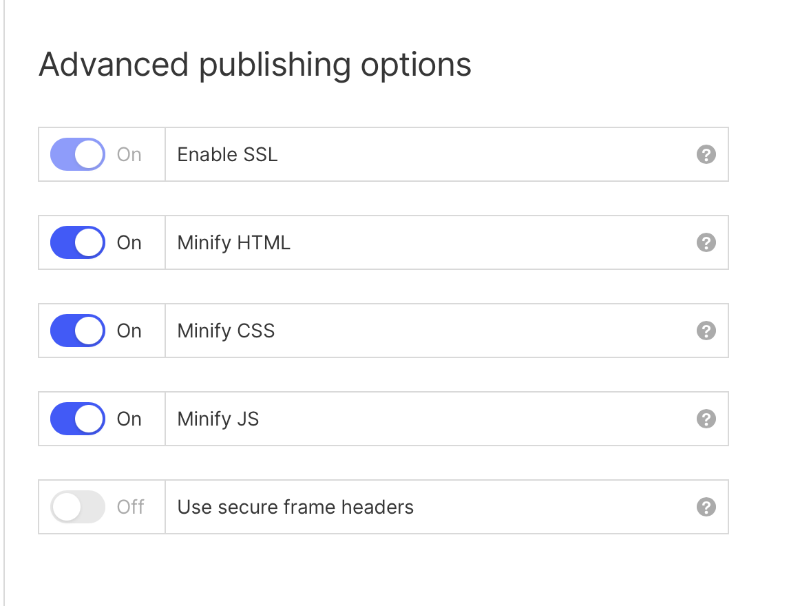
Also ensure that you minify your HTML, CSS and JS in the Project Settings under "Publishing" shown below:
If you follow the tips above you should see improvements immediately on your site. If you need help with your project, contact us here.
Did you find this article helpful?
Give it a thumbs up!

Learn how to design high-converting landing pages with Webflow's best practices, engaging your target audience with simplicity, clear CTAs, and captivating visuals.

In this blog we explore how incorporating custom code into your Webflow projects can enhance functionality, flexibility, and creative possibilities that will take your design to new heights.

To maximise your productivity and streamline your workflow in Webflow, we've compiled a set of essential tips and tricks that will enhance your efficiency.
%402x.svg)